I’m beginning to wonder if viz in tooltip is too much fun…the possibilities are endless. Here’s a way to show how the rank of a certain product, segment, brand, etc has changed compared to last year – in the tooltip! You can take the concept of a bump chart and make it more text-based. Workbook can be downloaded here.
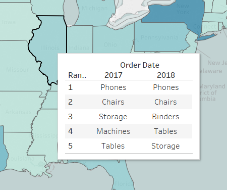
Here’s the scenario, we want to see which of our sub-categories are our top sellers in different states, and we want to compare that to last year. For a simple version, we can take the time period we are interested in, the brand, product, etc we are interested in and create our rank for the metric we are interested in. In this example, it’s Year, Sub-Category & Sales. You can set your view up like so:
![]()
![]()

This tells us, in 2017, Chairs were our top seller, but in 2018, Phones were our top seller. Now we can add this to a map tooltip to see how this has changed in each state:
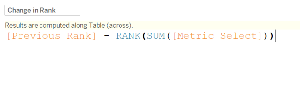
Now let’s take it to the next level by showing the position changes of our top products in 2018. The first thing we want to do is find the product’s rank in the previous year. We can accomplish this with a lookup (metric rank simply being the default RANK(SUM(Metric Select)) ):
![]()
Next we want to capture the difference between the current rank and the previous rank, like so:
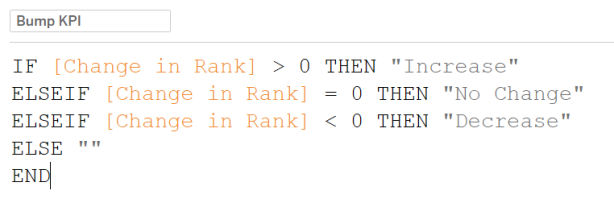
We end up with calculations for: a) The Ranks b) The previous Rank c) The change in Rank. We need them all separate because we need to be able to compute them differently. Lastly, we can add a KPI to determine which shapes/colors to use:
Now it’s just a matter of incorporating this KPI on color, shape, etc and setting the compute using:
![]()
![]()
![]()
Now you’ve got your advanced position change tooltips:
![]()
