I recently came across the use cases where someone needed a KPI to be coloring their chart when it was showing all of the information, but wanted the KPI to be removed when certain values were filtered out – The KPI only applied to the aggregate, and thus it was confusing/did not apply once values had been filtered (they had the same need on a sheet that was using a reference line). Below you will find a brief write up on how to create a KPI/Reference line that can be toggled on and off based on if a filter has changed – but keep in mind, this logic could be used to cycle through different KPI’s, change the measure being used, etc – some neat possible use cases!
The workbook used in this example can be found here: workbook link
The first step we will need to do is create a FIXED calculation on the dimension we are wanting to filter. In this example we are using “Sub-Category”:
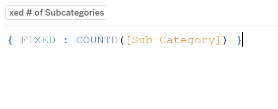
(note that this could be written {COUNTD([Sub-Category])} as well)
This calculation is going to return the total unique Sub-Categories in the data set regardless of our filter selections.
Next we will create a standard COUNTD() calculation with a slight twist:
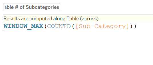
This count distinct will change as we filter out Sub-Categories. We are adding the WINDOW_MAX() in this case so that if we didn’t sell a certain Sub-Category in a given Quarter it isn’t going to throw our results off. For example, if we filterd out 2 of the 17 Sub-Categories, we would expect the COUNTD() to return 15, in one Quarter – however, it could be that we didn’t sell a single Label product, so that Quarter would return 14 where every other quarter is returning 15. We want everything in our view operating off the same number, in this case, 15.
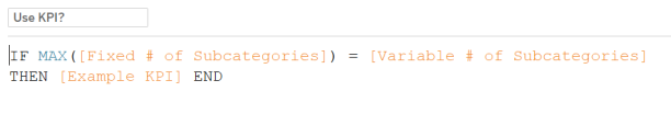
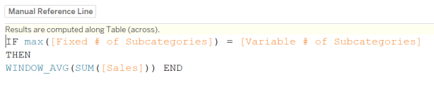
The last step is to simply compare our calculations and return our desired KPI if the values are equal:
Now you can set the colors of your KPI to the desired colors and color “NULL” to be gray or whichever color makes sense.
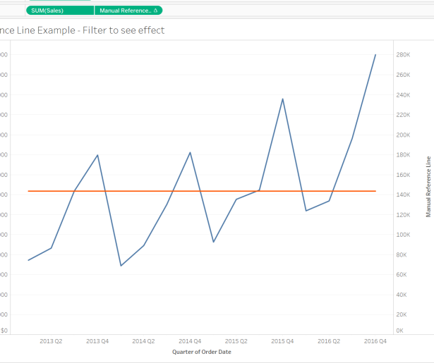
Now, this same logic can be used to dynamically show and hide a reference line:
…and create a dual axis with this calculation to get the desired effect: